New Author Advice
Many new authors ask for advice on getting started with self-publishing their books, and I try to answer each message personally. However, there is a lot of overlap on the answers, so I've prepared a self-help guide for new authors.
I also get a lot of requests to read and review books. As a general rule, I've decided not to review other authors' work.
Because I'm a full-time writer, I spend all of my time writing and researching, so I'm constantly reading "for work." I occasionally read, but there are a lot of books on my wish list, and I like to do other things, like my daily cycling or spending time with my family or dogs. I get a lot of requests to read, review, and endorse books, but my schedule just doesn't permit it. I also am wary that if I don't like something I read, I don't want to feel any pressure to give a dishonest review or hurt someone's feelings.
So I'm more than happy to give some basic advice on getting started. I'll recommend podcasts, resources for covers and editing, and some marketing info.
Here is an index of the information below:
- All About Book Covers
- Plot Tools
- Editing Your Book
- Politics and Taboo Topics
- Content Aggregators
- Marketing Resources
BOOK COVERS
Click for larger image
The cover is one of the most important things you will deal with when marketing your book. One piece of advice...don't use your neighbor's kid or even a friend to do this task. You need to find someone who has experience in doing BOOK COVERS, and it is a different skill than just doing graphic design.
Look closely at the covers of the best-selling books on Amazon. Look at the books as thumbnails, too, because that is the size people will see your book in the book listings. A good cover design has simplified elements and contrast with the title.
My first cover, for a book called Ace Gonzo, I had my girlfriend create a cover. Why not? She's been a graphic designer for over twenty years. It wasn't a big mistake, and the cover turned out nice enough, but she doesn't read fiction and we were both clueless about what makes for a good cover. I told her that it should look "icy," because it was set in Antarctica, and I think the book definitely has a cold, icy look. On a scale of 1-10, she now says she'd give it a "6."
One thing that stands out most to me is that my name is obscured, and the red does not have a lot of contrast with the black background. At this point in a writer's career, your NAME is your BRAND. People who like your work are looking for your name, so you want that to be prominent.


When I published my second book, Flying Soup, we went a different route. I came up with the name, Flying Soup, because a character in the book steals cans of soup from his mother's pantry and throws them at cyclists...I thought it was catchy. So when it came to the cover design, I knew that there were religious and political elements to the book, so by default chose a donkey, and elephant, and a cross.
I found an artist from Australia at oDesk.com (now upWork), and asked him to incorporate these elements into a design. What he came back with was a line drawing that was quite skillful, but not exactly ready for the cover. After scanning the picture, Kat "colored" the design in Photoshop and incorporated it into a cover layout. At this point, we were aware of things like contrast, so the title really stood out when viewed at a smaller size; the cross in bright yellow was also visible. But close up, the image is very cartoonish. We were pretty proud of our first grownup cover and book.
Click on the Flying Soup image to see the new rebranded cover and title, "FELL."
An Honest Critique of the Flying Soup Cover
After a dozen books, we can now look back at Flying Soup and see MAJOR flaws. Compared with Slow Burn, Ebola K, and The Last Survivors, the book looks very cartoonish. It has experienced lukewarm sales over the years, and most readers only find it when they're waiting on a new Slow Burn or another one of my books in a series. I've since taken Flying Soup down from Amazon because of something I'll talk about later...politics and controversial topics.
Actual Slow Burn 1 Cover Prototype
First Success: The Slow Burn Cover
Slow Burn was the first book that I went through a site where multiple artists submit a design, and you get to choose. Artists were excited about the topic, so I received over 250 designs. Many of those were variations on one design, but at this point I didn't know what I was looking for. I had told the artist exactly what I wanted for Flying Soup, so in this new exercise I just gave a blurb about my book and didn't micromanage the process. I was pleased with the results. In this scenario, I think I spent about $350-400, which may seem like a lot, but your cover is one of the most important parts of your book...if readers don't like your cover, they won't buy your book.
In a nutshell, when you find the "right" cover, it will knock your socks off.
To the right is the actual prototype. I think the only changes made were to increase the size of my name, and center the man on the page a little more. When I saw this cover, it felt right.
Working with a Professional Graphic Designer
Compare and contrast this selection scenario with another experience...at one point I decided to try a different artist who worked with another successful author, and asked them to create another cover for one of my books because my usual artist was busy. We agreed on $250, and the new artist wanted half up front. I was promised covers within a few days, but three weeks later I still didn't have anything. When the artist finally presented me with three options, they were not something that I could use. I paid the second half as agreed, but decided not to use the covers.
Generally with a graphic designer, you go back and forth with changes until you decide on something you like. They might give you an estimate that sounds something like "$200, which includes two revisions," or "$350, which includes all revisions, a 3D book rendering, and Facebook ads." They may charge you more for excessive revisions, so you want to get it close to right sooner than later. When you initially talk with an artist, ask for their fee up front, and ask how they handle revisions. Get it in writing if you can...a professional artist should not be offended if you ask these questions. If the artist gets offended, or doesn't know, I'd suggest finding another one.
The advantage of going through something like 99 Designs to find a designer is that you can let others with creative skill to help you come up with a vision for your book, and you get to see different styles. That expensive first round was a little tough to swallow for a new writer, but it has more than paid off over time. That one artist has earned a lot more of my business.
Stock Images
In some cases, it's helpful to find a stock image that communicates something about your book as a starting place for your graphic designer. I've found that my graphic artist has much quicker turnaround if I send him a photo, which he may or may not use. Also, giving the designer an idea of what the book is about is essential.
Use stock images from a reputable site such as Shutterstock or Dreamstime, and make sure that the graphic is licensed for commercial distribution. Some images are only available for news stories and not for commercial use.


Also, beware of companies that collect images from around the web and redistribute them as "free stock photos." Companies like Getty Images have legal departments who will come after users and hit them with hefty fines and copyright lawsuits. It doesn't matter if you knew nothing about it—if your graphic designer chose an image and didn't get clearance, YOU (not the designer) will be held responsible because YOU benefited from the use of the image.
These sites will charge you a fee to use the image, which vary by site. You will receive a PDF license at checkout.
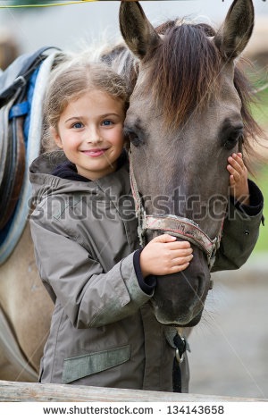
The example to the left is for a story in the works by a friend. She created a marketing blurb for her book which described a teenaged girl who loves horses who brings two people together. It's a romance...not too steamy...but Margaret picked this first image (Fig. 1) of the girl and the horse for her cover. But if you flip through the images, consider what the images communicate and who the audience is. To me, the first image (Fig. 1) communicates something about a girl who's in love with her horse, but might appeal to teenage girls with a thing for horses...kind of a Nancy Drew genre book. Fig. 2 tells a different story. The same model perhaps with a broader appeal to an older audience...still loves her horse, but the horse is secondary to her sex appeal. And in Fig. 3, a young girl with her horse. All three are girls with a horse, but the images tell a different story and appeal to different audiences. The following two cover prototypes were created from the Shutterstock images (graphic design by Kat, example only).
One last thing on stock images... it will benefit you greatly to look at books in your genre and become familiar with the cover art that others have used. Early on, we found other authors had used stock images that we were considering for Slow Burn and Ebola K. We chose to find other images that made the covers unique.
Fonts and Style
This might seem like a strange detail, but Kat helped me sort through the 99 Designs covers for Slow Burn, and in addition to looking for a good graphic design, she was a stickler for typography and the fonts. Before this exercise, I thought nothing of fonts. But I've learned over time that fonts are a big deal.
She told me once that the "hallmark of an inexperienced graphic artist is the desire to use MULTIPLE FONTS in a design." Your best bet is to stick to no more than TWO font families—for example, there are multiple styles within the Arial/Helvetica font family, which include "bold," "black," "regular," and "light." Also, don't go crazy with fancy or heavily stylized fonts. They are sometimes not readable in a thumbnail, so generally I would say to avoid them.


An interesting example is Slow Burn. Slow Burn uses a special font that has some interesting alternate letters with zombie-like elements accessed through capitals. However, the artist, in his wisdom, chose to use those special elements in only one letter—the zombie hand in the "U" (Fig. 1). If he had used all of the special glyphs, then the title is too busy (Fig. 2). Click on the thumbnails or the arrows to compare the two versions versions.
And check out option three (Fig. 3). Okay, I would never use a script font for a zombie book. But this example shows how just a simple change in the font makes Slow Burn less of a zombie book and more like housewife porn.
Kat also showed me how things like the spacing between the letters and amount of space between lines are important. Notice in the final title the letters have an even amount of space between them (Fig. 1), and the design looks "tight." The words "Slow" and "Burn" are pretty close, without a big gap. The spacing between lines of text is called leading. It comes from the concept in old-style typesetting; strips of lead were placed between lines to give space. Space between individual letters is called kerning. The last two examples show too much leading (Fig. 4) between the lines, and uneven spacing between the letters (Fig. 5). Pay attention to these details if you want a professional-looking cover. An newbie graphic artist may not be aware of these concepts. So when do these come into play? If you go through one of the sites like 99 Designs and ten artists present you with ideas, look carefully at how your title is handled. A professional cover artist will pay as much attention to your title as the rest of the cover...it is your BRAND.
PLOT TOOLS
There are many books out there about writing, so I won't go into the details of actually writing your book. However, I'm happy to share a couple of techniques I've used for plotting my books.
Glass whiteboards in the office with plot notes
One technique that I use for organizing my plot is to put ideas on Post-It Notes. I usually work with Kat in the brainstorming phase, and we'll go to a favorite BBQ joint with long tables where we can spend some time. Usually a brainstorming session last about 2 hours. We come up with random ideas...for example, in Slow Burn: City of Stin, Kat used to hang out with friends in a bar in downtown Austin, and the City of Austin Power Plant sign always had burned out neon behind the "A" and the "U" in Austin. What seemed like a random fact became the title of the book.
We also take Post-It Notes on road trips, which is where we come up with a lot of ideas. For example, when my son graduated from college and we took a road trip to the ceremony in College Station, we started noticing tanks and grain silos in rural farming areas had a single ladder up the side...perfect for someone hiding out from zombies! This made its way into Slow Burn 8 as a group of survivors created a colony on top of one. And the two little girls in Slow Burn 8—the "timekeepers" Khyla and Kinsley—were a couple of adorable girls we met at the BBQ joint while we were plotting. The manager had put them up to walking up to us and asking to be in Bobby's book. We started thinking about what makes little girls tick...every little girl has a diary with a cute little lock on it, and they like to jot things down. In the zombie apocalypse, they'd been charged with recording events for the colony's historical record.
Once the ideas are down on notes, categories start to emerge. I write the categories on different-colored Post-It Notes, and sometimes use colored markers.
In my collaboration with T.W. Piperbrook, we mimicked the Post-It Note technique with an online tool/App called Trello, because we are in different states and can't use the Post-It Note technique. We use the same techniques with notes, and they can then be accessed on both a laptop and a smartphone, iPad, or tablet. Since it's web-based, all updates to the notes are immediate.
Example of the Trello-based plot for The Last Survivors 3
Trello also allows the user to assign color labels, so I assign each character a color. At a glance, I can see how the book flows, making sure that there's enough back and forth in the story.
Another technique I've used in the past is to use a spreadsheet for plotting out characters. I'll post a copy of the spreadsheet later so you can check it out.
POLITICS AND TABOO SUBJECTS
Right now, politics are tricky. So I recently looked into rebranding Flying Soup and going through a re-edit to bring it more current. After reading the book, I've realized that it's possibly offensive to a subset of my readers, so for now I've taken it down. One of the best parts of the book is an accounting of a tent revival my parents took us to as kids... it's an accurate portrayal of an real-life evangelical event. A preacher in the book falls from grace through a series of choices he makes as he's tapped to be a vice presidential candidate. When I wrote it ten years ago, politics weren't as contentious as they are right now.
The last lesson learned: be careful when incorporating politics, religion, and other taboo subjects into your writing. Right off the bat, you might offend half of your readers, and that's not necessarily a great strategy if you're a new fiction writer.
Do you want to be a pundit, or do you want to be an author?
If your name is Bill O'Reilly, Bill Maher, Glenn Beck, or Rachel Maddow, then you're most likely tapping into a base who already has similar views, and you'll sell a lot. I bet a few of you just read that list and had a gut reaction to a name or two, and you probably did a quick count to see if I only listed conservative or liberal names. It was half and half, by the way.
But if you're an independent writer, it's best to stay away from touchy subjects and write to the mainstream public, unless your writing is specifically geared towards a particular group (you might even let your reader know in the description that your book has controversial subject or leans a particular way...if not, you open yourself up to bad reviews from readers who will resent downloading something they have issues with).
Also, be very careful about expressing any opinions publicly. That includes on your personal Facebook page. You may inadvertently accept a friend request from a reader who might discover that you differ politically, so it's just safe to avoid the topic altogether.
So should you write under a pen name and avoid the issue altogether? That can be a good idea if you are vocal about your opinions and like to share your opinions. But once you take the step of writing under your own name, you must be very careful...and your readers might not necessarily share your views.
I also make sure that I have a beta reader who has a completely different view of the world than I do...I want to make sure that I'm not offending anyone, or even writing something that might be construed as controversial.
Just remember, if you stay in the middle, you double your audience.
That's about it for now...I'll write more later.